The 7 Essential Types of Logos for Modern Brands
A logo is the primary anchor for consumer memory and brand recall. The seven essential logo types are monograms, wordmarks, pictorial marks, abstract marks, mascots, combination marks, and emblems. Each style communicates a distinct psychological tone, and selecting the right framework directly impacts how easily prospective clients remember your company name. When exploring the value of a custom designed logo, evaluating which core structure matches your operational footprint is essential.
| Logo Type | Best Use Case | Primary Advantage | Scalability Level |
|---|---|---|---|
| Monogram (Lettermark) | Businesses with long or multi-word names | Streamlines complex names into compact marks | High (Excellent for small icons) |
| Wordmark (Logotype) | New companies with distinct, memorable names | Maximizes direct name recall and recognition | High (Needs space on wide banners) |
| Pictorial Mark | Established brands with clear visual associations | Language-independent, instant visual anchor | High (Vector icons scale effortlessly) |
| Abstract Mark | Tech, innovative, or multi-service companies | Conveys complex values through unique geometry | High (Easily adapted across mediums) |
| Mascot Logo | Family, food, community, or sports brands | Creates personable, high-engagement connection | Moderate (Requires detail reduction) |
| Combination Mark | Startups, home service contractors, B2B firms | Delivers both name recall and visual symbol | Very High (Icon and text can separate) |
| Emblem Logo | Schools, automotive, agencies, heritage brands | Traditional authority, prestige, badge aesthetic | Moderate to Low (Complex internal detail) |
Monograms, Wordmarks, and Hybrid Combination Marks
Monograms (or lettermarks) focus exclusively on typographic initials. If your business operates under a long title, converting that name into a clean acronym allows you to fit your branding on compact surfaces like vehicle door magnets, pens, and social media favicons without sacrificing legibility.
Wordmarks (logotypes) rely on the entire business name styled through distinct typography. Companies with short, catchy titles benefit immensely from wordmarks because they drive rapid name recall. Every glance reinforces the business name itself.

Hybrid combination marks unite a typography-driven wordmark with an accompanying icon or lettermark. This design is widely considered the gold standard for emerging service companies. Discovering what custom logos accomplish for your business reveals that combination marks deliver unmatched versatility: you can run the full lockup on your website header, use the standalone symbol for social avatars, and display the clean wordmark across horizontal fleet vehicle wraps.
Abstract Marks, Pictorial Symbols, Mascots, and Emblems
Pictorial marks (or logo symbols) use a recognizable real-world object to represent your company. An HVAC company might use a stylized flame and snowflake, while a lawn care team uses an elegant leaf silhouette. Pictorial marks bridge language barriers and establish an immediate visual metaphor for what you do.
Abstract logo marks step away from literal objects, utilizing custom geometric shapes to convey conceptual meaning, movement, or precision. They allow businesses with varied service lines to maintain a single unified identity without tying themselves to one specific tool or trade.
Mascot logos introduce an illustrated character that acts as the visual spokesperson for your organization. Mascots excel in fostering warm, family-friendly connections and generate elevated engagement across local social media campaigns.
Emblems encase text and imagery inside a defined geometric border, crest, or seal. Emblems convey heritage, craftsmanship, and institutional permanence, though they require careful drafting to ensure fine line work does not blur when scaled down on smaller mobile displays.
Advanced Logo Design Variations: Dynamic, Animated, and Negative Space
Modern digital platforms have opened up exciting variations beyond static shapes:
- Dynamic Logos: These identity systems maintain a stable core framework while changing colors, patterns, or secondary graphics depending on the seasonal campaign or specific digital platform.
- Animated Wordmarks: Designed for digital interfaces, video intro bumpers, and interactive apps, subtle motion gives the logo extra energy while reinforcing visual hierarchy.
- Negative Space Pictorials: Clever visual illusions use the background space between shapes to reveal a secondary hidden image, rewarding viewer attention and dramatically increasing brand recall.
Core Principles of Impactful Logo Design
A successful logo does not require excessive visual complexity. In fact, excessive decoration often detracts from brand memorability. When evaluating why you should have a brand not a business, your visual identity must center on timeless design principles:
- Simplicity: A clean silhouette is easier for the human brain to process during quick glances on highway billboards, passing trucks, or digital feeds.
- Memorability: Distinct visual quirks make your brand stand out amidst a sea of regional competitors.
- Relevance: The overall tone, colors, and fonts should reflect your industry while appealing directly to your ideal customer base.
- Versatility: The design must remain sharp whether reproduced on a 16-pixel favicon, an embroidered uniform shirt, or an oversized trade show banner.
- Timelessness: Avoid short-lived aesthetic fads to prevent the need for costly complete rebrands every two years.
Typography, Color Harmony, and Simplicity
Typography establishes the voice of your brand. Clean sans-serif typefaces project modern efficiency and technical precision, while sturdy serif fonts communicate legacy, stability, and trust. Whichever direction you choose, maintaining strong kerning (the spacing between characters) guarantees instant legibility from a distance.
Color selection carries subconscious emotional weight. Cool blues inspire trust and reliability; vibrant greens suggest growth, health, and outdoor care; deep oranges and reds command attention and convey responsiveness. Grounding your identity in core branding fundamentals ensures you limit your primary palette to two or three balanced shades, ensuring strong contrast against both light and dark backgrounds.
Cross-Platform Scalability: Print, Web, and Document Formats
Modern businesses showcase their logos across an expansive array of digital touchpoints and printed items. To maintain crisp visual edges across responsive mobile devices and expansive print signage, all master assets must originate as vector graphics (such as SVG and EPS files) rather than static pixel bitmaps.
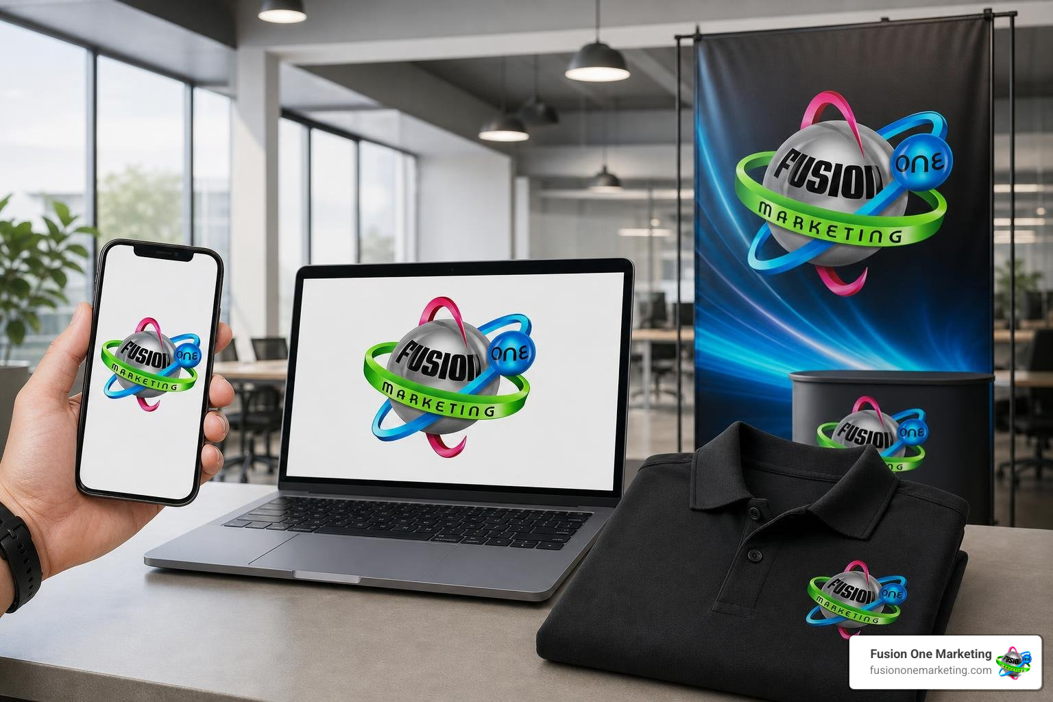
In the digital space, modern developers generate dynamic Open Graph (OG) social preview images using automated API handlers at 1200×630 pixels. These programmatic endpoints dynamically insert the company logo, custom background, and page titles to create polished link cards for social feeds.
For formal business documentation, technical proposals, and corporate reports created in publishing engines like LaTeX, maintaining brand consistency across every page is equally achievable. By utilizing layout packages such as scrlayer-scrpage or combining background with fancyhdr, businesses can declare separate underlay layers to embed subtle page-framing borders, place the vector logo neatly in the header margin, and align automated pagination (\thepage) in the footer.
Practical Steps to Build a Complete Brand Identity on a Budget
Creating an eye-catching brand identity on a modest budget follows a structured, deliberate workflow. Understanding why consistent branding matters helps keep your team focused during every phase of development.
- Conduct a competitor audit across your service region to identify visual patterns to avoid.
- Outline your brand’s core values, target audience, and primary service lines.
- Sketch rough concept thumbnails to test layout compositions and geometric shapes.
- Select balanced typography and a high-contrast three-color palette.
- Assemble a centralized brand kit featuring the following essential deliverables:
- Vector master files (SVG, EPS, editable PDF)
- High-resolution web assets (PNG with transparent backgrounds, optimized JPG)
- Color variations (Full-color primary, solid monochrome black, reversed white)
- Social media profile squares, horizontal banners, and micro-favicons
- Brand guideline sheet documenting hex codes, font families, and minimum clear-space rules
Streamlining Affordable Logo Design Using AI Generation and Vector Kits
Emerging digital tools and generative AI workflows have accelerated the early concept phase for budget-conscious entrepreneurs. Modern creative software allows business owners to test color palettes and explore varied layout compositions before committing to production. Integrating AI-assisted concept generation allows teams to save substantial design hours while rapidly prototyping shapes and symbols.
For businesses refining their digital vector assets, open-source graphic suites like Inkscape offer powerful node manipulation, path tracing, and SVG export capabilities without recurring software fees. Pairing accessible ideation workflows with dedicated vector software provides an affordable bridge between initial brainstorming and production-ready brand assets.
Testing and Refining Across Real-World Touchpoints
Before rolling out your new visual identity, test your designs across every practical medium:
- Favicon & Mobile Screen Test: Scale the standalone mark down to 32×32 and 16×16 pixels. Does the visual icon remain clear, or does it turn into a muddy smudge?
- Vehicle & Signage Visibility: Print your logo on standard paper, tape it to a wall, and step back twenty feet. Is the business name readable within three seconds?
- Monochrome & Inverted Contrast: Convert the design entirely to black and white. If the design loses its clarity without color gradients, simplify the internal contours.
- Fabric & Embroidery Proofing: Ensure fine lines and micro-text are converted to solid shapes so embroidered uniform patches and screen-printed shirts reproduce smoothly.
Frequently Asked Questions About Logo Creation
Which logo type is the most versatile for a new service business?
A combination mark is widely considered the most versatile logo type for emerging service businesses. Because it pairs a distinct typographic wordmark with an independent graphic icon, it offers multiple operational configurations. You can use the complete stacked lockup on yard signs and work trucks, run the horizontal layout on website navigation headers, and extract the standalone icon for mobile app icons, social media avatars, and vehicle door stamps.
Should a startup begin with an icon-only mark or a wordmark?
A startup should almost always begin with a wordmark or a combination mark rather than an isolated, icon-only mark. Established corporations can rely on standalone pictorial symbols only because they have spent decades building universal consumer awareness. For a growing business, establishing direct name recall in your service area is crucial. Presenting your full company name clearly ensures every prospective customer understands who you are and what you do.
What essential file formats should be included in a logo package?
A complete, professional logo package should always contain:
- Scalable Vector Files (SVG, EPS, AI, or Vector PDF): Resolution-independent formats required for commercial printing, vehicle wraps, uniforms, and signage.
- High-Resolution PNG Files: Exported at 300 DPI with transparent backgrounds for seamless placement over digital graphics, slide decks, and website headers.
- Optimized Web Images (WebP/JPG): Compressed, fast-loading image formats tailored for websites and email signatures.
- Monochrome Variations: Solid black and reversed all-white versions designed for dark backdrops, single-color print receipts, and sponsorship boards.
Conclusion
Building an eye-catching, memorable visual identity does not require an enterprise budget. By focusing on clean typography, distinct geometry, and functional scalability, your brand can establish immediate credibility and command attention across every local market you serve.
At Fusion One Marketing, we help growing businesses integrate smart brand design into a complete digital growth framework—combining custom web architecture, targeted local SEO, paid advertising, and high-impact social campaigns to build lasting market authority.
When you are ready to build a visual presence that turns local searches into lifelong customers, review these essential 5 things to consider when creating a logo and reach out to our team to power your growth today.