
What Is a Campaign Landing Page and Why It Outperforms Standard Pages?
A campaign landing page is a standalone web page built for one specific marketing objective, such as lead capture, product purchase, event registration, or donation. It removes standard site navigation, competing calls-to-action, and unrelated content so every headline, image, and form field directs visitors toward a single conversion action. This focused architecture is why campaign landing pages outperform standard pages: they align precisely with the ad copy, search query, or promotional email that drove the click, a principle known as message match.
Standard web pages serve broad exploration. They feature header menus, footers, social media feeds, sidebars, and multiple calls-to-action (CTAs). While this open architecture works well for general research, it introduces the psychological barrier known as the paradox of choice. When visitors face too many competing pathways, decision fatigue sets in, causing hesitation, exit clicks, and wasted advertising spend.
By contrast, an effective conversion asset removes all exit ramps. Businesses that implement 10 to 12 tailored experiences across their ad sets see a 55% increase in lead generation compared to those deploying only one or two generic pages.
Mastering the essentials of creating a landing page requires stripping away superfluous design elements and organizing every headline, image, and form around immediate user action.
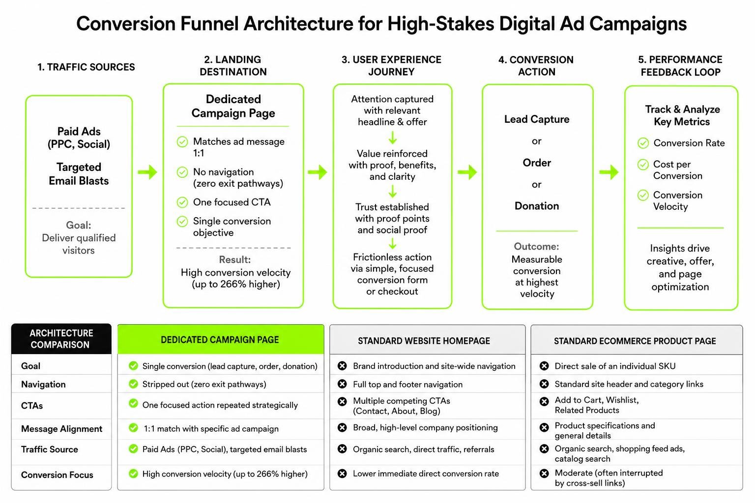
| Feature / Metric | Dedicated Campaign Page | Standard Website Homepage | Standard eCommerce Product Page |
|---|---|---|---|
| Primary Goal | Single conversion (lead capture, order, donation) | Brand introduction and site-wide navigation | Direct sale of an individual SKU |
| Navigation Menu | Stripped out (zero exit pathways) | Full top and footer navigation | Standard site header and category links |
| Call-to-Action (CTA) | One focused action repeated strategically | Multiple competing CTAs (Contact, About, Blog) | Add to Cart, Wishlist, Related Products |
| Message Alignment | 1:1 match with specific ad campaign | Broad, high-level company positioning | Product specifications and general details |
| Traffic Source | Paid Ads (PPC, Social), targeted email blasts | Organic search, direct traffic, referrals | Organic search, shopping feed ads, catalog search |
| Conversion Focus | High conversion velocity (up to 266% higher) | Lower immediate direct conversion rate | Moderate (often interrupted by cross-sell links) |
10 Real-World Teardowns: E-Commerce, Advocacy, and High-Stakes Promotions
To understand why some layouts achieve remarkable conversion rates while others leak potential revenue, let’s dissect 10 live and historical digital campaigns across consumer eCommerce, advocacy groups, and political fundraising.
Product Teardowns: Apple, KraveBeauty, GoPro, Asus, and Troubadour Apex
- Apple iPhone 15: Apple’s approach demonstrates the power of visual hierarchy and frictionless purchasing. The page uses rich product-in-use imagery and 3D device views, but its defining technical strength is a sticky “Buy” button that remains anchored at the top of the viewport on desktop and mobile. While Apple relies heavily on global brand equity rather than customer reviews, its conversion path stays uncluttered.
- KraveBeauty (Great Barrier Relief): This skincare brand overcomes consumer skepticism using short, engaging video application tutorials embedded above the fold. By showing how the formula works across diverse skin tones and labeling complex active ingredients with playful, accessible language, they dismantle buyer hesitation before the customer reaches the purchase button.
- GoPro HERO12: High-ticket action electronics face rigorous consumer scrutiny. GoPro combats this with interactive comparative matrices, lining up specs side-by-side against older models. Rather than relying on technical jargon, they feature real user footage paired with award badges to justify the product’s premium price tier.
- Asus ROG Ally: Gaming hardware demands immediate proof of capability. Asus utilizes trust badges, third-party performance benchmark awards, and clean aesthetic callouts highlighting processor speeds and thermal performance. The page groups complex specifications into digestible, expandable visual clusters so readers are never overwhelmed by data.
- Troubadour Apex Backpack: For lifestyle eCommerce, value proposition copy must immediately emphasize lifestyle benefits over raw technical fabric specs. Troubadour accomplishes this through clean visual storytelling, combining waterproof testing clips, modular storage diagrams, and immediate customer reviews positioned directly below the primary checkout CTA.
Anatomy of a Political Campaign Landing Page: Trump, Bennet, and Becerra
Political fundraising operations run some of the most rigorously tested, conversion-driven environments in the digital space. Every design choice is engineered to capture financial support or volunteer data under strict deadlines.
- Donald J. Trump Campaign: The Donald J. Trump – Make America Great Again ecosystem employs intense urgency triggers, bold high-contrast color palettes, and single-purpose contribution funnels. Exit pathways are eliminated, replaced with preset donation amounts and recurring contribution checkboxes that streamline mobile payments.
- Michael Bennet: On the Get Updates – Michael Bennet for Colorado platform, the layout centers on community-driven micro-conversions. The design relies on clean typography and low-friction lead forms asking only for a first name, email, and ZIP code, proving that lowering initial form friction drives higher overall sign-up volumes.
- Xavier Becerra: The platform for Xavier Becerra – Build, Protect, and Lead California leverages crisis framing and legal defense achievements to mobilize urgent financial support. By integrating one-click ActBlue processing, the page reduces transactional friction for returning donors, converting intent into contributions within seconds.
Ballot Measure Strategy: Analyzing Proposition 3 and Proposition 40
Advocacy groups and ballot measure committees must translate complex legislative language into clear public choices without losing reader attention.
- Yes on Proposition 3: The advocacy layout for Yes on Proposition 3 utilizes strong visual endorsements from recognizable labor unions, educators, and first responders. The copy anchors the measure directly to local school funding and healthcare protection, positioning the policy around public accountability and direct community benefits.
- Facts on Proposition 40: When voters face nuanced policy questions, an educational layout is paramount. The resource at Facts on Prop 40 | Yes on 40 addresses voter skepticism directly through an interactive FAQ accordion. By explaining fiscal mechanics, revenue distribution, and asset thresholds in clear terms, the page systematically dismantles opposition arguments while keeping the user moving toward the voting action prompt.
Conversion Psychology and Proven Frameworks for Marketing Wins
A winning campaign page does not rely on artistic guesswork; it is built on validated human psychology and cognitive science. The most critical factor in conversion rate optimization is maintaining a single, uninterrupted path forward. Research demonstrates that landing pages featuring one focused call-to-action convert up to 266% higher than pages presenting multiple competing options.
Marketers must eliminate decision paralysis by integrating the 5 proven components for high ROI landing pages, which include a captivating headline, clear benefit-driven value proposition, strong visual social proof, a low-friction form, and an unmissable CTA.
Applying the principles of scarcity and exclusivity further motivates action. Whether highlighting limited seasonal appointment slots for an HVAC tune-up in Birmingham, AL, or offering an introductory pricing tier, ethical urgency prompts visitors to take action rather than postponing their decision.
However, maximizing volume is only half the battle. Understanding what is a good lead ensures your forms capture prospects who possess genuine intent, budget, and geographic fit for your offerings.
Reducing Friction with Benefit-Focused Copy and Clear CTAs
Copywriting must address the prospect’s primary question: “What’s in it for me?” Instead of listing generic service specifications, frame your copy around tangible outcomes.
- Feature-focused statement: “We install 16-SEER variable-speed air conditioning units.”
- Benefit-focused statement: “Lower your monthly energy bills and keep your home cool all summer with quiet, high-efficiency cooling.”
Place your primary CTA prominently above the fold so visitors do not have to scroll to take action. For longer pages, implement a sticky CTA that follows the user during their scroll journey, ensuring the conversion action remains accessible at all times.
Building Unshakeable Trust with Video, Testimonials, and FAQs
Conversion rates rise when risk is systematically removed. For local service companies and eCommerce brands alike, integrating authentic social proof is essential:
- Product-in-Use Video Demos: Short video clips showcasing installations, product unboxings, or real-world use help eliminate buyer doubt.
- Third-Party Reviews and Badges: Authentic Google reviews, BBB accreditation seals, and industry licensing badges provide immediate reassurance.
- Interactive FAQ Accordions: Addressing common pricing, warranty, and timeline questions directly on the page neutralizes objections before they cause a bounce.
Optimization Strategies: Mobile Speed, Heatmaps, and Rigorous Testing
Building a beautiful page is meaningless if it fails to load quickly or frustrates mobile users. Achieving consistent campaign profitability requires continuous understanding conversion rate optimization principles to iteratively improve key performance metrics.
When how to run a successful Google Ads campaign is executed correctly, the traffic sent to your dedicated page represents warm, high-intent prospects. Optimizing your layout through structured split testing can lift conversion rates by up to 160% compared to unoptimized experiences.

Designing a High-Speed Mobile Campaign Landing Page
Google recommends a page load time of under 2.5 seconds to meet Core Web Vitals standards and prevent severe bounce rates. Mobile visitors decide whether to stay within the first three seconds:
- Asset Compression: Compress high-resolution images into next-gen formats (WebP) and defer non-critical JavaScript.
- Mobile-First Layouts: Design touch targets and CTA buttons large enough for thumb clicks, avoiding cramped link clusters.
- Streamlined Form Entry: Enable autofill attributes and minimize required typing fields on mobile devices.
Using Real-Time Behavioral Data and CRM Integration to Scale Results
Behavioral analytics tools turn your landing page into a real-time market intelligence asset. By analyzing user actions, you can identify hidden conversion bottlenecks:
- Heatmaps: Track where users click, hover, and look, showing which sections generate interest and which are ignored.
- Scroll Depth Tracking: Determine how far down the page users travel to place your secondary CTAs before engagement drops off.
- Session Replays: Observe live user sessions to spot form errors, broken links, or friction points in your layout.
- CRM Integration: Route captured leads directly into your sales pipeline or automated dispatch software to ensure immediate follow-up.
Frequently Asked Questions About Digital Campaign Performance
How does a campaign landing page differ from a website homepage?
A campaign landing page is an isolated, standalone web page built for one specific marketing objective, removing main menus and external links to keep visitors focused on a single conversion. A homepage is designed for broad exploration, brand positioning, and multi-directional site navigation.
What is the most critical element for landing page conversion rates?
The most critical element is a single, clear call-to-action (CTA) supported by strong headline-to-ad message alignment. Pages featuring a single CTA convert up to 266% higher than pages with multiple competing offers.
How many landing pages should a business deploy per campaign?
Businesses should deploy dedicated pages for each distinct audience segment or service category. Research indicates that maintaining 10 to 12 targeted landing pages leads to a 55% increase in lead generation over using a single generic page.
Conclusion
Every successful marketing initiative relies on what happens after a prospect clicks your ad. As our teardowns illustrate—from consumer electronics brands like Apple and GoPro to high-stakes political advocacy campaigns—the winning formula remains consistent: clear message alignment, zero navigation distractions, unshakeable trust signals, and a single, frictionless path to conversion.
At Fusion One Marketing, our all-in-one Digital Domination program integrates custom SEO, PPC management, social media marketing, and high-converting asset development to deliver measurable, sustained business growth. By continuously monitoring behavioral heatmaps, optimizing mobile page speeds, and running disciplined split tests, we turn your ad clicks into predictable revenue.
If you are evaluating your current digital strategy and deciding whether you need a dedicated landing page or a complete website overhaul, our team can help you identify the right path forward and build conversion assets that outpace the competition.